Copper & Crystal Flower Chandelier: Romantic Vintage Glow
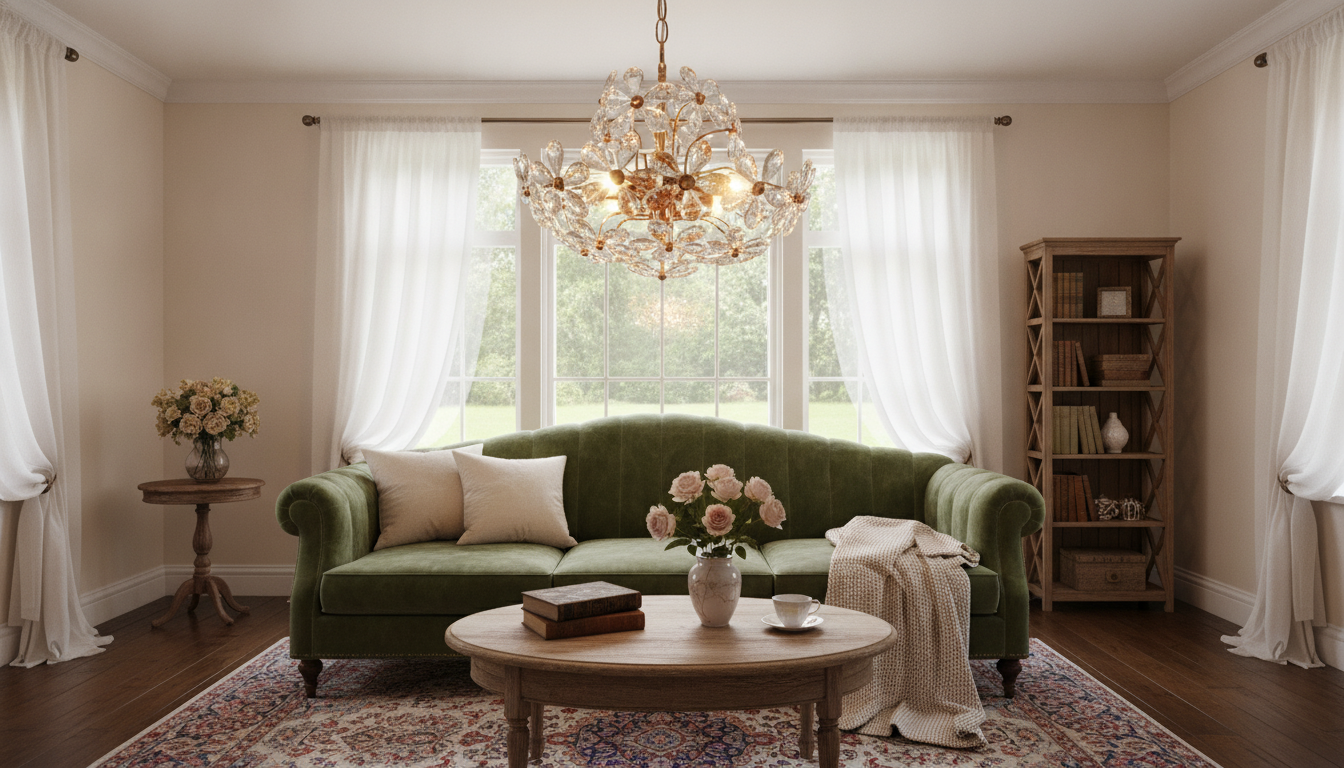
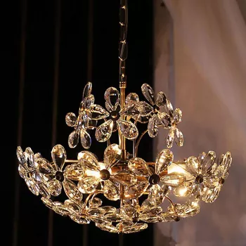
Romantic Vintage Crystal Flower Chandelier with Copper Finish: A Warm, Floral Statement Light
Soft crystal “petals,” a warm copper-toned frame, and vintage-inspired curves combine to create a chandelier that reads as both romantic and refined. The result is a statement piece that feels gentle rather than flashy—sparkly, but not icy; decorative, but still practical. Below are room-by-room ideas, sizing guidance, bulb recommendations, and a few installation and care notes so the fixture looks purposeful in your space (not simply “hung”).
What Makes the Look Romantic and Vintage
The charm comes from a mix of floral geometry and warm metalwork—two elements that naturally soften a room’s lines.
- Crystal flower elements mimic blossoms, creating a delicate silhouette even when the chandelier is off.
- A copper finish reads warmer than chrome or brushed nickel, bringing a slightly antique, candlelit mood.
- Layered sparkle feels gentler: crystal edges catch pinpoint highlights that look luminous rather than mirror-bright.
- It plays well with curves and texture, pairing naturally with carved wood, floral textiles, rounded furniture profiles, and warm neutrals.
Best Rooms and Style Pairings
This type of chandelier tends to look best where it can be treated as a centerpiece—supported by surrounding materials that echo its warmth.
Dining room
Centered over a table, the copper tone adds “evening glow” energy and makes everyday meals feel more intentional. Linen runners, wood tables, and small brass or copper accents help the fixture feel integrated instead of isolated.
Bedroom
A crystal flower chandelier can create a boutique-hotel vibe—either centered in the room or positioned to highlight a bed area. Keep the light quality warm and consider layering with bedside lamps for a relaxing, non-glary feel.
Entryway or foyer
In an entry, the floral crystal shape becomes an instant first impression. If you entertain often, adding a dimmer lets you switch from bright arrivals to a softer welcome at night.
Style matches and palettes
- Style matches: vintage, French country, cottage, romantic modern, and transitional rooms that need a softer focal point.
- Color palettes: ivory, blush, sage, deep green, charcoal, warm wood tones, and copper accents.
Sizing and Hanging Height Guide
Proportion matters more than almost anything else. A chandelier that’s slightly too small can look accidental; one that’s too large can crowd sightlines and make the room feel compressed.
- Choose diameter and drop based on room size and ceiling height so the fixture feels balanced—never overpowering.
- Dining rooms need clear sightlines; aim for comfortable clearance above the tabletop for serving and conversation.
- Bedrooms need walk-around comfort; keep extra headroom near pathways and door swings.
- Low ceilings: prioritize a shorter drop and compact canopy. Tall ceilings: a longer chain/rod helps the chandelier feel anchored, not floating.
| Location | Suggested hanging height | Spacing tips |
|---|---|---|
| Dining table | About 30–36 in above tabletop | Center on table; keep chandelier width comfortably smaller than table width |
| Bedroom (center) | Keep bottom at least ~7 ft from floor (or higher in walk paths) | Avoid directly over ceiling fan; coordinate with bedside lamp warmth |
| Entryway/foyer | Clear headroom in walking areas; higher for frequent traffic | Align with architectural centerline; consider a dimmer for evenings |
| Living room | Typically ~7 ft+ clearance depending on seating layout | Position so it doesn’t visually collide with tall shelving or artwork |
Light Quality, Bulb Choices, and Dimmers
Crystal and copper look best under warm light. The goal is a flattering glow that lets the crystal “twinkle” without creating harsh glare.
- Choose warm-white bulbs (typically 2700K–3000K) to complement the copper finish and keep the sparkle romantic rather than bluish.
- Clear bulbs emphasize crisp highlights and a more pronounced sparkle.
- Frosted bulbs soften brightness and create a more diffuse glow—often better for bedrooms and smaller dining rooms.
- Add a dimmer so the chandelier can shift from practical light to evening ambiance.
- Layer lighting with lamps or sconces to reduce shadows and keep the room balanced.
For general guidance on brightness and color temperature, the U.S. Department of Energy’s overview is a helpful reference: How to Choose Light Bulbs (Brightness and Color Temperature).
Materials, Finish Coordination, and What to Match
Copper is naturally expressive—warm, slightly earthy, and easy to build around when repeated thoughtfully.
If you want a deeper foundation in lighting principles and how layers of light work together, the Illuminating Engineering Society is a strong starting point: Lighting Design Basics.
Installation Considerations
For electrical safety reminders and jobsite basics, see OSHA’s general guidance: Safe Work Practices (Electrical) — General Guidance.
Care and Cleaning for Crystal Flower Details
Product Snapshot
- Romantic Vintage Crystal Flower Chandelier with Copper Finish — a decorative statement light with crystal “petals” and a copper-toned frame that shines brightest when paired with warm bulbs and a dimmer.
- 23-Piece Professional Makeup Brush Set — a practical add-on for bedroom or vanity zones where warm, flattering lighting helps with getting-ready routines.
FAQ
Does a copper-finish chandelier work with other metal finishes in the room?
Yes. Keep one metal as the dominant finish, repeat copper in one or two smaller accents, and use a bridging finish like matte black or aged brass so the mix feels balanced.
What bulb color temperature looks best with crystal and copper tones?
Warm-white light—generally around 2700K to 3000K—keeps the glow romantic and prevents the crystal from reading overly cool or bluish.
How high should a chandelier hang above a dining table?
A common guideline is about 30–36 inches above the tabletop, adjusted based on ceiling height, the chandelier’s size, and comfortable sightlines across the table.










Leave a comment