Perfect Color Schemes: Undertones, Contrast, and Ratios
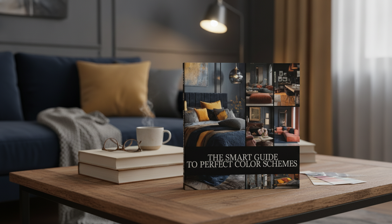
The Smart Guide to Perfect Color Schemes: A Simple System for Confident Home Decor Choices
Color affects how a room feels long before furniture or decor gets noticed. A clear, repeatable method helps avoid paint regret, clashing undertones, and spaces that look “almost right” but never finished. Below is a practical system for planning color step-by-step—so any room can land on a cohesive palette, consistent contrast, and a balanced mix of neutrals and accents. For more guidance, see Free Guide: Color Psychology for Interior Design | Domestika.
Start with the room’s fixed elements (the non-negotiables)
Before you choose paint, choose what you’re actually decorating around. Fixed elements quietly control what colors will look “right” in your space. For further reading, see 12 Essential Books About Color – The Aesthetics of Joy.
- List what will stay: flooring, large upholstery, countertops, tile, brick, wood tone, and major art pieces.
- Identify undertones: warm, cool, or neutral. This is the fastest way to prevent the “mysterious clash” that happens when two colors are technically similar (like beige + gray) but pull in opposite directions.
- Note light direction and strength: north-facing light reads cooler; south-facing reads warmer. Evening bulbs can shift a “perfect” daytime paint into something unexpected.
- Choose a calm anchor neutral first: a wall/large-surface neutral that harmonizes with the fixed elements gives everything else a stable base.
If undertones feel tricky, compare your samples with two controls: a true white and a warm cream. You’ll quickly see whether a “neutral” is secretly pink, green, yellow, or blue. Sherwin-Williams has a helpful overview of undertones and why they show up differently in real rooms (Sherwin-Williams: Understanding Undertones).
Choose a palette structure that matches the mood
Once the anchor neutral is set, pick a color relationship that matches how you want the room to feel.
- Monochromatic: one hue in multiple values; clean, soothing, and forgiving for open layouts.
- Analogous: neighboring hues; cohesive, warm, and easy to layer with natural textures.
- Complementary: opposite hues; bold energy, best when one color is dominant and the other is controlled.
- Triadic: three evenly spaced hues; playful, modern, and easiest when two colors are muted and one is saturated.
Common palette structures and where they work best
| Palette type | Best for | Watch-outs | Quick tip |
|---|---|---|---|
| Monochromatic | Bedrooms, minimalist living rooms, calm offices | Can feel flat without texture/contrast | Use at least 3 values: light, mid, deep |
| Analogous | Family rooms, kitchens, cozy nooks | Can drift “muddy” if all mid-tones | Add one crisp neutral (white/cream/charcoal) |
| Complementary | Entryways, dining rooms, statement spaces | Overuse can feel loud | Let one hue be 10–20% of the room |
| Triadic | Kids rooms, creative studios, eclectic spaces | Can look chaotic without a dominant neutral | Keep two hues muted; use one as the accent |
If you like visual tools, a color wheel makes harmony rules easy to see and test (Adobe Color). For trend and color direction, the Pantone Color Institute is a reliable reference point.
Build contrast the easy way: light, medium, dark
A room looks intentional when it has a clear value range—light, medium, and dark—even if the colors are simple.
A practical room-by-room color checklist (with an AI-friendly prompt approach)
Dominance ratios that keep palettes cohesive
| Approach | How it looks | Suggested ratio | Where to apply |
|---|---|---|---|
| Classic balanced | Safe, cohesive, decorator-like | 60/30/10 | 60% walls + big textiles, 30% upholstery/secondary surfaces, 10% accents |
| Neutral-forward | Calm, elevated, minimal | 70/20/10 | More neutral surfaces, fewer bold accents |
| High-contrast modern | Graphic, bold, curated | 55/30/15 | More black/charcoal and sharp accents |
Avoid the most common color-scheme mistakes
Make it actionable: a guided system that turns inspiration into a finished palette
If you want a done-for-you framework, The Smart Guide to Perfect Color Schemes (digital download) is designed for room-by-room decisions with an AI-ready palette checklist, so you can generate options quickly and then refine them with real-world swatches.
To see how color planning improves everyday items, even small “utility zones” benefit from matching finishes and undertones—like pairing wood warmth with the right neutral and metal tone. A simple example is an entry or kitchen corner styled with an Elevated Ceramic Pet Bowl with Solid Wood Stand that echoes your home’s wood tone and keeps the palette feeling intentional instead of accidental.
Quick palette planner (reference table)
| Palette role | Pick this first? | Examples | Where it shows up |
|---|---|---|---|
| Anchor neutral | Yes | Warm white, soft greige, light taupe | Walls, large rug, main backdrop |
| Secondary neutral | Yes | Cream, oatmeal, mushroom, light gray | Trim, curtains, bedding, upholstery |
| Grounding dark | After neutrals | Charcoal, espresso, deep navy | Frames, hardware, side tables, accents |
| Accent color | After dark | Sage, terracotta, ochre, teal | Pillows, art, vases, small furniture |
| Bridge color | Optional | Dusty rose, muted olive, smoky blue | Throws, ceramics, transitional spaces |
FAQ
How many colors should a room have to look cohesive?
Aim for 5–7 total colors, including 1–2 neutrals, a grounding dark, and 1–2 accents (plus metal/wood tones). For cohesion, repeat the main accent colors at least three times around the room.
What’s the easiest way to tell if a color is warm or cool?
Compare the swatch against true white and a warm cream in the actual room lighting. Check it at multiple times of day, and always reference your fixed elements (like flooring) since many grays and beiges hide strong undertones.
How can an AI palette help without making the room look generic?
Use AI to generate a few options with HEX codes, but constrain it with your real inputs: light direction, fixed materials, and your style. Then personalize by adjusting saturation/value and confirming with physical swatches before you buy.











Leave a comment